


Hello new blog design
If you have been reading my blog for a while now then you will probably know how indecisive I am when it comes to it's name and the layout. Well, the name is perfect now [after changing it about 7 times, oops] but the blog design was still bugging me. I had messed on with it and changed it god knows how many times but something was not right. It was too cluttered still even though it was a simple design.
On Friday night, I took the plunge and changed the design completely. From the Simple template to now the Soho one [both on Blogger], Call Me Caz has a brand new, cleaner and fresh design, ready for exciting content this year, and I couldn't be more happier with it. Due to this and the fact that it looks completely different, here is a post all about how to navigate yourself around my brand new looking space on the internet.
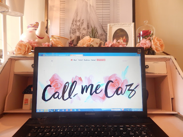
So say hello to my new blog design...


On Friday night, I took the plunge and changed the design completely. From the Simple template to now the Soho one [both on Blogger], Call Me Caz has a brand new, cleaner and fresh design, ready for exciting content this year, and I couldn't be more happier with it. Due to this and the fact that it looks completely different, here is a post all about how to navigate yourself around my brand new looking space on the internet.
So say hello to my new blog design...
This is the old Call Me Caz

As you can see it was a bit cluttered with the sidebar and the posts showing the main photo and the post intro. However, that is all gone.
As now I proud to introduce the new Call Me Caz

My beautiful header, created by the lovely Sarah, is still centre stage [I am still in love with it so shout out to Sarah], but now, you will notice above the header is a tab bar thing.
This is one of the latest features to appear and I am so excited by it [is that sad?! I think not].
The three lines goes to the side bar, which I will get onto in a minute, then we have a little home button to take you to the home page if you have done finishing a post.
Next up is the About, Contact, Disclaimer and Featured pages that were there on my previous layout so I wont go into that as its pretty self explanatory as to what they are.
Then we have my social media account links, again that were featured on my other design, and finally the search bar.
The fab thing about this tab bar is that is follows you as it scrolls down the page so making it easier if you want to go back to the home page or to search for something! Handy as like!

Now onto the sidebar [the three lines, top left] and this is basically for the contents, blog archive [so where you will find all my publish posts], my Twitter feed, and my other blog, In Time For T, that I am determined to start writing and publishing on.

By clicking on one of the contents, say Beauty for example, it will come up with all the posts I have labelled under that so if it is a certain type of post you just want to read then voila, all of them in one place!

Below my pretty header is the featured section. Now this shows you the latest post I have published and is the only one to include a little snippet of the text.

Finally, underneath the featured are my ten latest posts so you can keep up with my newest ramblings on and that is it! So much simpler yet fresh looking and more professional I think!
...
Well there you go, a brand new blog design for a brand new year!
Until next time
-------------------------------------
All photographs are my own
-------------------------------------
All photographs are my own
-------------------------------------


I really like your new layout! It looks so clean and fresh! I've been thinking about changing mine too recently. We'll see when I actually get to it, aha. xxx
ReplyDeleteMelina | www.ivefoundwaldo.com
Aw thank you, glad you like it! I agree, it looks so much cleaner and more fresh so it's perfect! Ooo cannot wait to see it if you do decide to change it! x
Delete